Get access to exclusive updates, the latest news and the inside scoop 🍨

Design Inspiration - The Best UK Jewellery Stores
We have assembled a list of the top 10 UK jewellery stores on the web to provide you with some web design inspiration.
Don't want to read the whole article? 😏Click here for chapters

Written by Madeleine
UK Jewellery Stores 💍
In today’s article, we have assembled a list of the top 10 UK jewellery stores on the web to provide you with some web design inspiration.
Whether you’re getting ready to launch your ecommerce business, or are looking for ideas on how you can redesign your online store, you’ve come to the right place.
So, without further ado, let's kick things off with the first jewellery store that has been featured within today's guide:
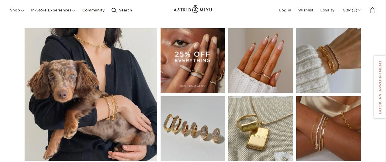
N0.1: Astrid & Miyu
Astrid & Miyu is a tremendous website, which is super simple for customers to navigate and explore.
The navigation bar features typical tabs such as; shop and search, but we idolise that this site highlights its in-store experiences as well as the products that are available for customers to purchase online.
The in-store experiences tab presents all of the services which customers can select before they visit a physical store. From what we can see, Astrid & Miyu offer; piercings, tattoos and welding at both of their studios in London and Manchester.
At the heart of this brand is community and community is a big thing for the company, which is why the navigation bar features a tab that directs website visitors to self-care content.
We love that the team at Astrid & Miyu thrive on customer feedback and positive vibes, as customers will be able to easily find all of the store’s best bits in one place. After all, what's a store that doesn't put its customers first?
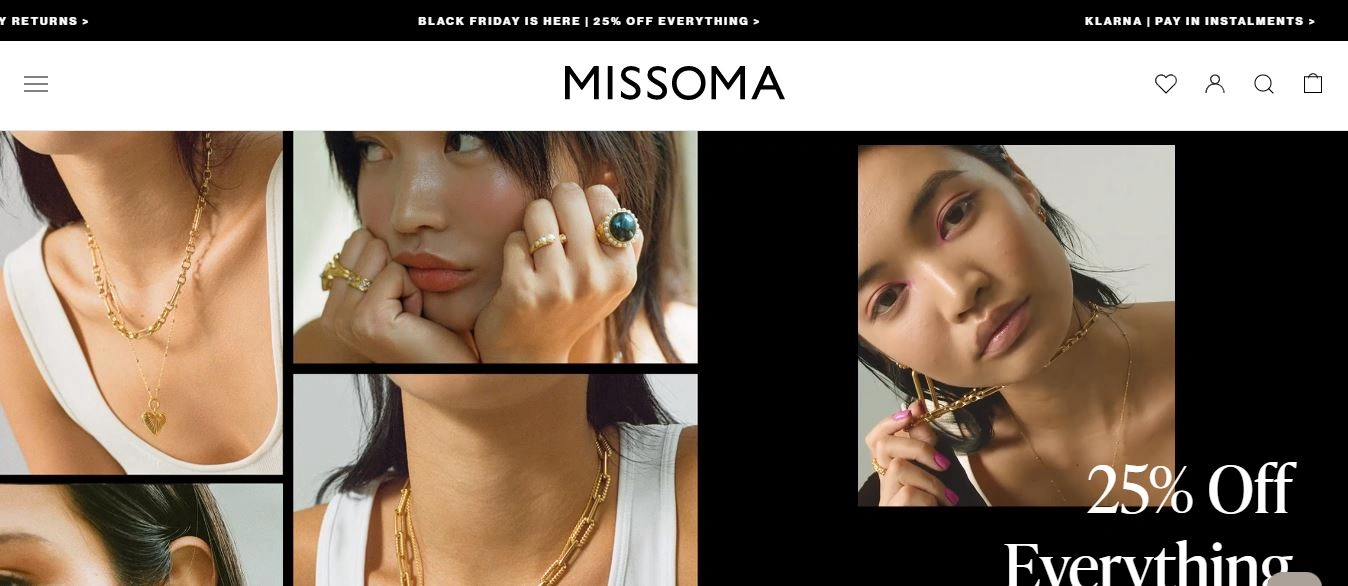
N0.2: Missoma
Missoma is a trendy website that strives to maintain an ecommerce edge. The homepage currently features an image gallery and video element that captures the authenticity of Missoma jewellery. It depicts a message – we have something for everyone, which is part of the brilliance of this store’s design.
As UK jewellery stores go, Missoma has to be one of our favourites, due to its straight-up approach towards style and elegance, as all jewellery is designed in-house and created by the team.
The Missoma website features a dedicated section on the left-hand side navigation bar for customers who are looking to purchase sustainably sourced products.
The brand currently produces products that are created from recycled metal jewellery. This tab provides transparent information on the company’s; sustainability journey, carbon footprint, community impact and their metals and sourcing.
Separately, the loading time of this jewellery store is much faster than many other ecommerce sites on the web, making it super responsive and user-friendly for Missoma customers.
N0.3: Monica Vinader
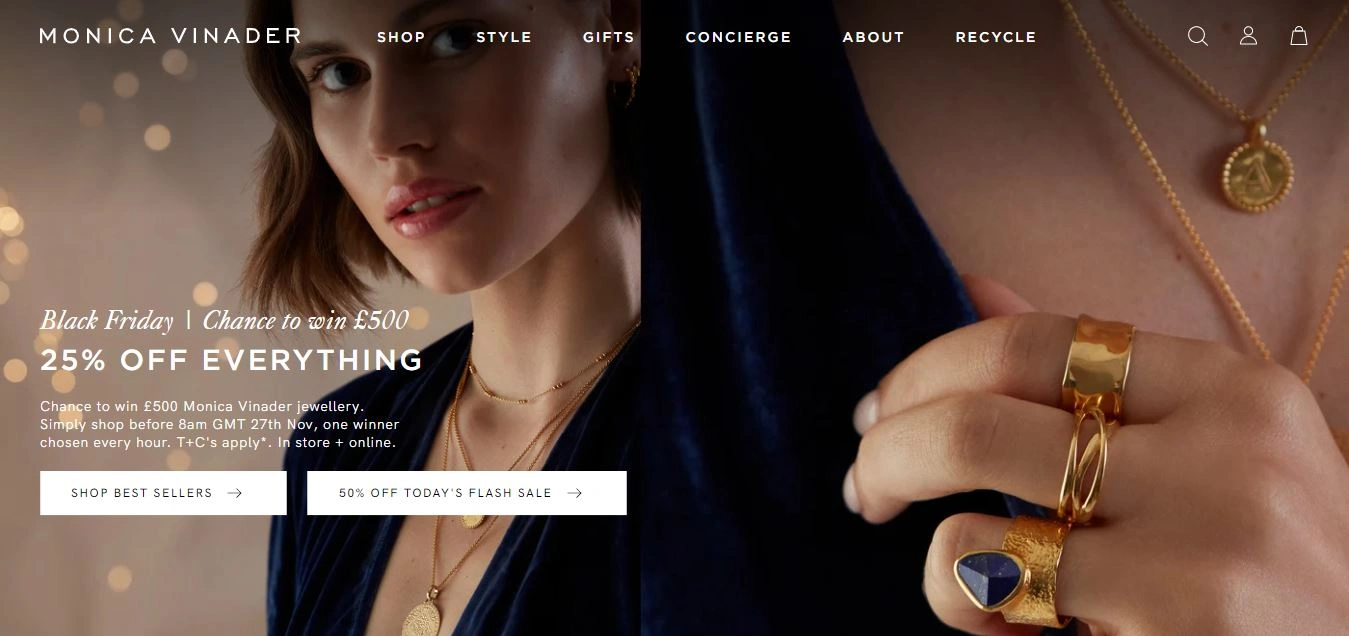
The next jewellery store in today’s guide is none other than Monica Vinader. Our eyes directly take us to the daily deals header on this website's homepage due to the luxurious and captivating imagery that has been implemented here.
Monica Vinader offers its customers some fantastic selections and we like that customers can browse through the store based upon what's new, what’s trending as well as what materials have been used to create the products.
This is one of the select few UK jewellery stores that offers its customers a little something extra via concierge services that cover; experiences and assistance.
For instance, customers can choose to book a piercing, have an item engraved, take advantage of virtual styling, be kept informed about exclusive events, have their jewellery repaired or recycled, seek help with ring sizing and so on.
Even though a magnitude of what we like to call 'extras' are offered, attention is driven to the core pieces of jewellery on this beautiful website, which is exactly how it should be.
Monica Vinader products are the main event and these additional services act as a bonus, which can be discovered easily via the store’s navigation bar.
N0.4: Estella Bartlett
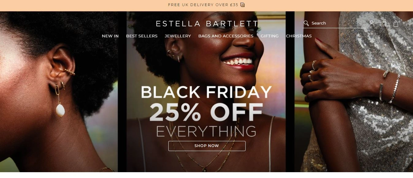
Estella Bartlett is one of the most elegant website designs which has been specially designed for jewellery purposes. The website’s branding caters for the store’s chic and sophisticated pieces which are manufactured to elevate everyday styles into something more spectacular.
The brand has shared its philosophy around meaningful and transformational jewellery and this message is translated throughout the store’s typography and visual elements.
For the environmentally-conscious consumers out there, we’ve found ourselves in the company of a jewellery store that's playing its part to help the environment.
Through its partnership with Traidcraft Exchange Estella Barlett's customers can give their unworn jewellery a new lease of life. To discover the process, customers need only head to the footer section of the website to find out more.
It is also here, via the footer, that customers will discover where Estella Barlett can be found on social media, not to mention the wide variety of payment options that are available for customers to utilise.
The store has also shared its sitemap so if there’s anything that buyers cannot find, this is sure to be rectified in due course.
N0.5: Daisy Jewellery
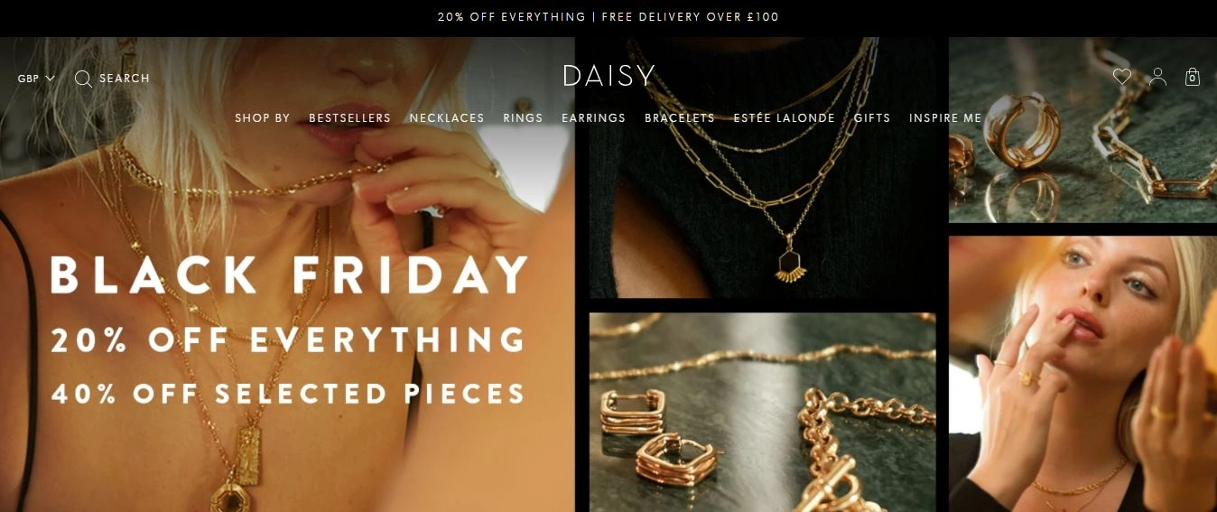
Dreamt up in London’s Portobello Road, after launching in 2009 with the namesake Daisy collection inspired by wildflowers, the brand has grown to cult status, fusing a bohemian state of mind with a wearable, contemporary jewellery design.
Daisy Jewellery happens to be one of our clients here at Karmoon so, we may be a little biased when we say this, but we think that their website is flawless.
The brand executes utter perfection and visual storytelling with stunning imagery and eye-catching typography. The typography of the site coordinates with the brand’s colour combination, to provide a positive UX and UI experience for customers across the store.
Have you visited Daisy Jewellery from a mobile or tablet device? Its presentation and usability are just as seamless as the desktop. Any online retailer that means business should ensure that their store looks and functions as it should across all devices.
N0.6: Soru Jewellery
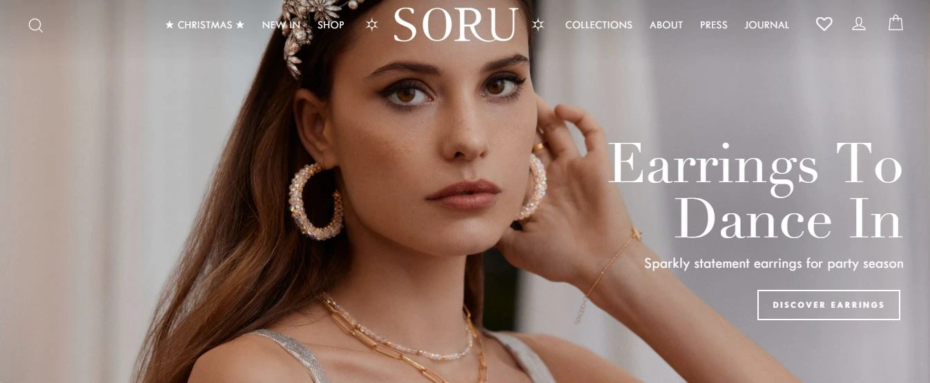
Soru Jewellery is the home of diamonds and anything that sparkles. For the customers who are eager to access a bit of glitz and glamour, this is one of the best UK jewellery stores to visit.
Much of the design’s focus is geared towards the holiday season, so any gift ideas can be viewed throughout several categories via the navigation bar, as well as; meaning, party or budget.
Soru Jewellery further subdivides its products into what’s new alongside an archive of the collections available. So, if party jewellery isn’t what browsers are looking for, perhaps they will find something within the brand’s core collection of; jewellery, gifts and bridal items.
As we’ve mentioned here in the journal before, it’s important to deliver seamless customer experiences and Soru jewellery have hit the nail on the head by offering their audience multiple ways to pay, with Klarna, the buy now pay later solution.
N0.7: D. Louise Jewellery
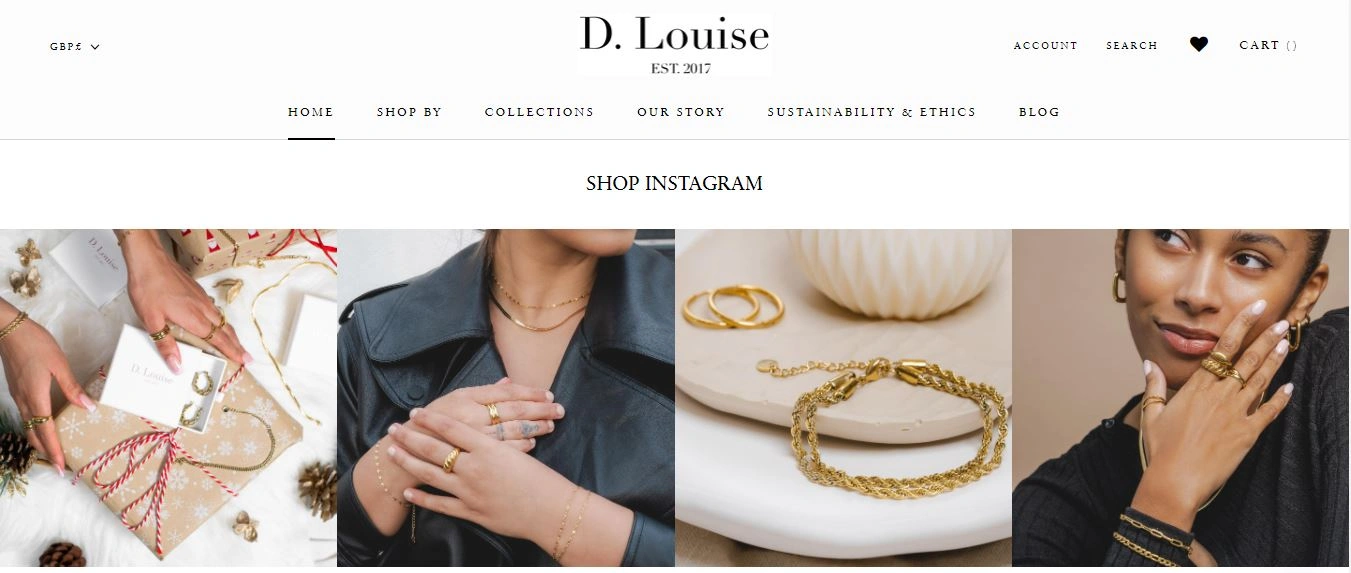
D. Louise Jewellery is a timeless and chic brand that specialises in high quality and accessible waterproof jewellery. Their products are designed for stylish people who don’t want to replace their jewellery.
Unlike jewellery that tarnishes and goes green after only a few wears, D. Louise guarantees not to lose colour even if you wear their products every day, in the pool or at the gym - how cool is that?
This ecommerce website attracts customers at first glance, as the homepage features an introductory opener from the company, informing customers of who the brand is, their mission and what customers can expect from D. Louise Jewellery.
We think that this is a nice touch and makes what is an already user-friendly website seem even more open with its customers. Another cool aspect of the website is a feature bar which is spread out right across the homepage.
If users scroll down, they will be able to see that D. Louise Jewellery has been featured in; Grazia magazine, WalesOnline, London On The Inside and Refinery29 which is a great tactic to utilise when converting browsers into buyers.
N0.8: Maria Tash
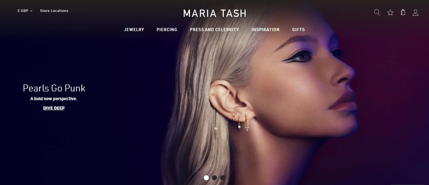
Maria Tash is a great example of the UK Jewellery stores on the web that aren’t afraid to stand out from the crowd. This ecommerce website utilises eye-catching designs and colourful backgrounds to capture the attention of its customers.
One thing that we adore about this website layout is its ease of navigation. Maria Tash segregates its content in many categories such as shopping jewellery by; style, piercing, gemstone or what’s been featured.
Additionally, customers can book an appointment to have a piercing, or visit the site to learn more about piercing aftercare - it’s all right there in the navigation bar.
If you’re looking for something trendy visit ‘Press and Celebrity’ Need a few ideas? Click ‘Inspiration’, or take a browse through the store’s ‘Gift’ tab to view Maria Tash’s holiday gift guide for the season.
With Maria Tash’s easy approach to navigation, customers should have no problem in finding what it is that they’re looking for, as the five bread crumbs at the top of the homepage allow users to navigate as per their needs and interests.
Furthermore, the store design features a search button on the top right corner, which helps customers to search for their required item without wasting time.
This design also features a shopping bag beside the search, wishlist and account icons, which allows users to secure checkout at the end of the shopping.
The interesting point is the top header where the latest collections and announcements are displayed in an alluring slideshow to keep website visitors in the know.
Overall, Maria Tash is one of the best ecommerce websites for its user-friendly and straightforward navigation characteristics.
N0.9: Muru London
Muru London specialises in curating designer jewellery with meaning. Designed in the UK, each unique creation is lovingly crafted with heart and soul.
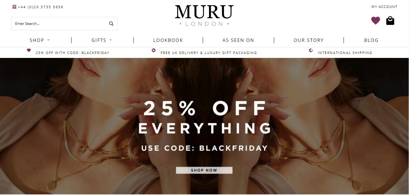
When this ecommerce website first loads, a call to action header can be seen on the homepage, which currently displays a 25% off of everything announcement for Black Friday.
Muru London’s website is predominantly black and white with flourishes of gold and silver imagery.
Additionally, gallery images are displayed underneath the announcement on the homepage with a call to action button within every grid image to direct customers towards their current collections.
Website visitors can easily locate information on the homepage such as; where to find the company on Instagram, how to care for their jewellery and how they can access customer reviews and we have to say, the brand’s transparency makes it one of the most credible UK jewellery stores on the web.
N0.10: Ella Palm
Ella Palm is another ecommerce store that has captured all of the features which a jewellery website should attain to promote a good sales experience for its customers.
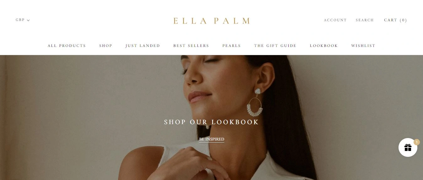
The brand’s designs are; simple, elegant, crisp and aesthetic which can be detected as soon as the website is entered. Currently, the homepage features a variety of stunning visual slideshows and imagery, highlighting Ella Palm’s delicate premium jewellery and accessories.
One of the unique features of this website that we adore is its focus on inspiring its customers on how to style Ella Palm jewellery with a curated lookbook. It is here that website visitors are invited to shop each look.
The navigation bar makes it super easy for website visitors to browse through all of Ella Palm’s products, whether this may be; best selling items, what’s just landed in-store or items within the pearl collection.
This website also features a magnitude of helpful information within the footer such as; contact information, a size guide, materials and care, returns, product warranties and more.
Have we missed out on one of the best UK jewellery stores that deserves to be featured within today's guide? Reach out and let us know.
If you’re actively looking to work with a Shopify agency designer or developer to assist you with your business, we’d love to hear from you. Get in touch to get started!
Get Started with Shopify
Looking to get started with Shopify? Take advantage of Shopify's 14-day free trial, no credit card is required.
If you're actively looking to work with a Shopify agency designer or developer to assist you with your business, we'd love to hear from you. Get in touch to get started!
Want to read some more?
Have a look over more posts related to this one

